Friday, 24 January 2014

Architectural design


Take a look at this incredible art work by a genius named Rafael Araujo. You'd think that there would be some form of computer based editing involved right?.. wrong. 


- In the midst of our daily binge of emailing, Tweeting, Facebooking, app downloading and photoshopping it’s almost hard to imagine how anything was done without the help of a computer. For Venezuelan artist 'Rafael Araujo', it’s a time he relishes. At a technology-free drafting table he deftly renders the motion and subtle mathematical brilliance of nature with a pencil, ruler and protractor. Araujo creates complex fields of three dimensional space where butterflies take flight and the logarithmic spirals of shells swirl into existence. He calls the series of work Calculation, and many of his drawings seem to channel the look and feel of illustrations found in Da Vinci’s sketchbooks. In an age when 3D programs can render a digital version of something like this in just minutes, it makes you appreciate Araujo’s remarkable skill. You can see much more here. (viaArchitectureAtlas)


http://www.thisiscolossal.com/2014/01/architectural-renderings-of-life-drawn-with-pencil-and-pen-by-rafael-araujo/ 


Friday, 17 January 2014

Business Card Designs


Business cards are vital when it comes to getting yourself or your company/ brand known and can be considered one of the most important marketing tools that he has. With it, you are giving your contact information to potential clients or existing customers to make more familiar with your name and at close reach. In order for the business card to do its job well, it must be professional, attractive and most importantly, memorable.

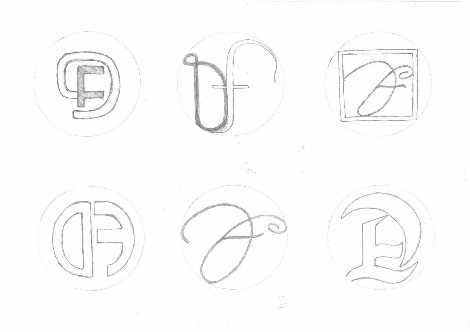
- Here are some of my design drawings and ideas for the creation of my own business card by using my initials as my ideas. I got inspiration for my designs from simply looking at different and creative styles of typography, and of course adding my own unique originality to them.


 This is one of two ideas that I was to choose as my final design that I chose to take further by editing them on (Photoshop), I chose this design because of the style of the typography also an effect was added to change the texture. I think that it is more visually stimulating than most of the other designs. 


I explored adding bright colour to the design, this was because the dark colour of the typography blended with the backgrounds that I was exploring with, so in that aspect I think that this design idea was not the best option, although the white background worked really well because of the contrast.


Here is my second final idea, and the one that I chose as my (FINAL). I like this design because of the simple approach that I took, I also like the gradient effects that I added to my initials (using the line fill option). I chose to use the colour black  because I thought a attractive design would also need an attractive yet simple background. Overall I think that It is an attractive design with a plain background in my opinion it it a good thing because it invites you to look at the design more.   


Here is a view of the the back of the business card, I made it look simple but at the same time it should have a classy touch to it. I added a black version as well  as a white to show variety.   


Here is a view of my main business card design and another design that I otherwise would not be using, while designing I made it so that these designs can interact, you can see this by the way the black from the middle spreads to the other designs.


Obviously these designs can't fit on one small business card but that doesn't mean that they cant be added to posters, leaflets and more  


Sunday, 12 January 2014

Montigu Logo Re-designing


Here is my logo redesigning process, I started by keeping the same foundations of the original logo, then breaking down the different aspect that make up the logo on a whole, in this case I started with the typography and switching between different styles of fonts. By having many choices I am able to try different combinations and then chose the best outcome when piecing everything together.


This is the second part of the design process, here we have illustrative drawings that will accompany the typography in the logo, I chose to explored different drawings of vegetables as the original 'Montagu' brand is for a restaurant and mostly do with food, also for me, having vegetables for me it will add a sense of freshness to the logo.


Finally I refined my illustrations, merged them with the typography and then added the appropriate  colour to to match the vegetable illustrations, with the colours I used the photoshop software to add the air brush painting effect.  Before choosing these designs as my potential final ideas I played around with the order of the designs and eventually came to these conclusions.


This is my final outcome for redesigning of the 'Montagu' logo, I chose this design because of it's  simplicity, I like the way the typo sits on top of the illustration and how well they work together. I also like the way the contrast between the light and the dark work together and do not clash with one another.


Thursday, 5 December 2013

Organic food and drinks


Here are some of my design drawings for the project regarding advertising, these design drawings go towards makings a final poster to advertise an event that will be held with the theme of an organic food festival. Next I intend to experiment with them by adding filters on photoshop, colour, text and to add to different backgrounds.


Here is the start to my Exploration with my design ideas, I have first looked at applying the right colours to the specific drawings.


Advertising Brief


- This is an A3 page that I made as my own introduction into this particular project. The 1st section is about creating a 3D floor-plan /design and maquette of a building that will be used to host my food festival event. 2nd section talks about the next stage which will be to do with the advertising side of things, in this case product packaging.

 The final section also has to do with advertising but this time in a more common form of a leaflet/leaflets. It is explains my exact plan of action for each of the three sections of the project that I will be working on hence the name (Proposition).


New Brief 


- For my next brief I have been given the task of looking further into creating design ideas/ solutions in connection to the advertising assignment that I have just covered. A new aquarium, local fashion store called 'Costal', or a festival of locally grown and made organic food and drink, in my case it will be the organic food idea.

Within the first week I am to investigate research corporate identity in the area that I have chosen, analyse the style of the work and how the logo has been applied and used on various promotional materials and similar businesses to inform my own work.


- For this project I will have to investigate primary and secondary research while giving consideration to the audience; the clients, the product, the medium, the theme and the time/cost. To organise and order these topics I will first need to produce a mind map plan, I will also be producing some design sketches while exploring with different materials, I could also explore other mediums such as; photography or video. For secondary research I can get help from newspapers, books, the internet, local businesses, museums and other options.


- Finally I will need to present my findings and outcomes in a powerpoint to the class group order to share information, this way I will be able to receive feedback from my peers to therefore improve on my design.


Friday, 15 November 2013

advertising

My previous brief was an introduction into advertisement. I began by creating a visual mood board showing all the different types of advertisements that can be seen everywhere from televisions to bus stops and bill boards.

This shows the variations of adverts and the techniques they use to attract attention, also it tells you that not all adverts must look
the same, you can tell this
 by simply observing the mood board.
Before any research material I created a mind map
showing the things that I would need to consider both primary and secondary researching and also for designing.
Its purpose is so that I am reminded of the things I should be looking at and the important things that I should include.


The first part of my research began with looking at advertising agencies (Abbot Mead Vickers) & (Ogilvy) to observe and analyse their style of advertising and the techniques they use. I looked at their images and went into detail about the specific techniques they used.


Next I researched an artist whose work inspired me and whose style I could incorporate into my own work,in my case it was the style of his illustrations and the level of detail he puts into them.

 I liked the way in which he adds colour to his work, makes it look more realistic so I also wanted to add these traits to my work.


I thought it was important to add some information about the whole world of advertising, the process and how it actually works, so I researched the Advertising Standards Authority (ASA).

I wrote about what happens when an advert is made and that it first has to be analysed by the ASA to see if it is acceptable to be let out into the public.                                                                                


The next step I took was to look at the types of food that I will be basing my project around, also the different techniques within adverts that help to sell the product, this helped lead on to the next area of research which included primary research design drawings.