Business cards are vital when it comes to getting yourself or your company/ brand known and can be considered one of the most important marketing tools that he has. With it, you are giving your contact information to potential clients or existing customers to make more familiar with your name and at close reach. In order for the business card to do its job well, it must be professional, attractive and most importantly, memorable.
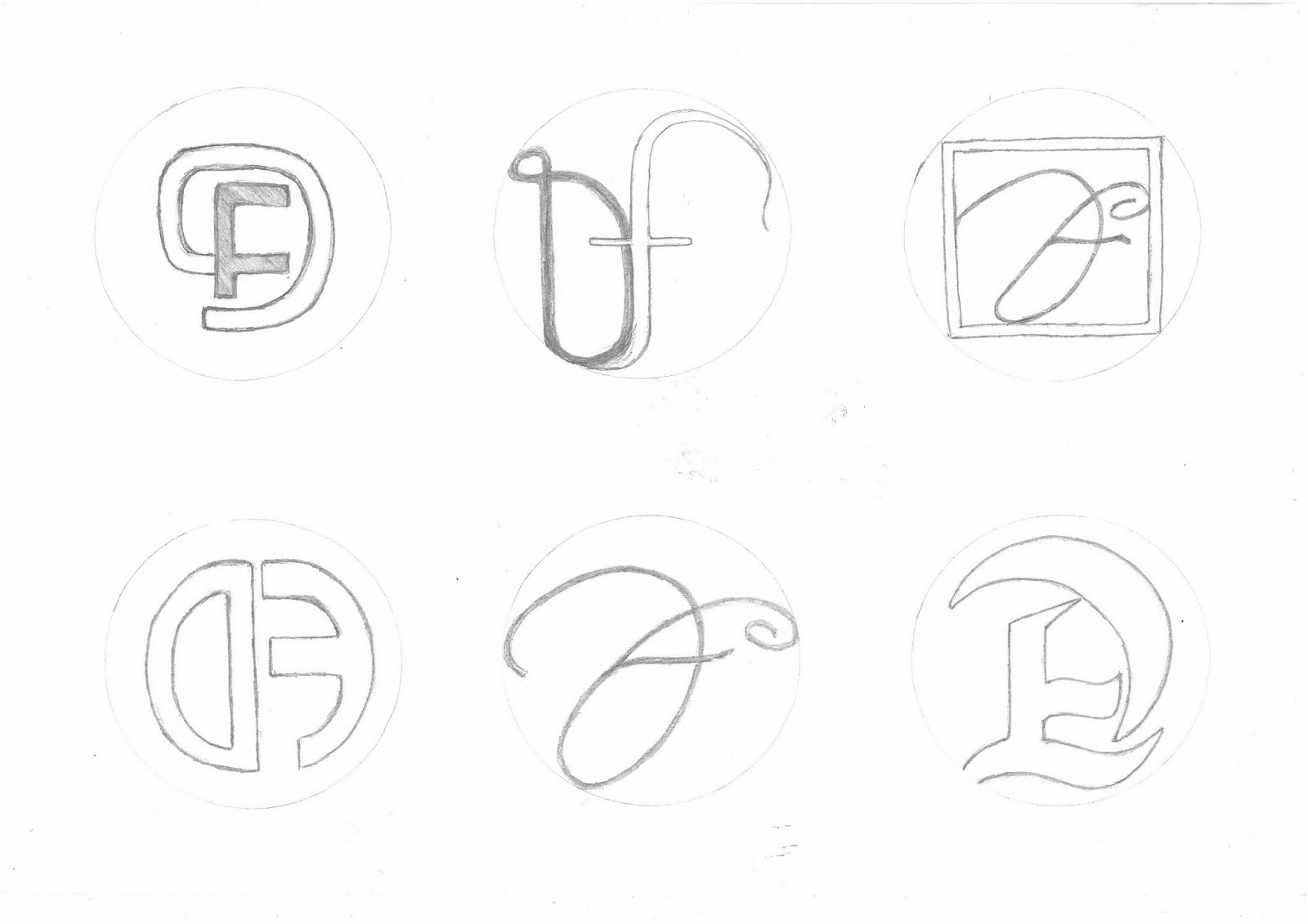
- Here are some of my design drawings and ideas for the creation of my own business card by using my initials as my ideas. I got inspiration for my designs from simply looking at different and creative styles of typography, and of course adding my own unique originality to them.
This is one of two ideas that I was to choose as my final design that I chose to take further by editing them on (Photoshop), I chose this design because of the style of the typography also an effect was added to change the texture. I think that it is more visually stimulating than most of the other designs.
I explored adding bright colour to the design, this was because the dark colour of the typography blended with the backgrounds that I was exploring with, so in that aspect I think that this design idea was not the best option, although the white background worked really well because of the contrast.
Here is my second final idea, and the one that I chose as my (FINAL). I like this design because of the simple approach that I took, I also like the gradient effects that I added to my initials (using the line fill option). I chose to use the colour black because I thought a attractive design would also need an attractive yet simple background. Overall I think that It is an attractive design with a plain background in my opinion it it a good thing because it invites you to look at the design more.

Here is a view of the the back of the business card, I made it look simple but at the same time it should have a classy touch to it. I added a black version as well as a white to show variety.

Here is a view of my main business card design and another design that I otherwise would not be using, while designing I made it so that these designs can interact, you can see this by the way the black from the middle spreads to the other designs.

Obviously these designs can't fit on one small business card but that doesn't mean that they cant be added to posters, leaflets and more


No comments:
Post a Comment