Sunday, 26 January 2014

SketchUp Process & 3D Model


As one of the propositions for my latest advertisement brief, I gave myself the objective of making a 3 dimensional design on the 'Google SketchUp' software, these screen-prints show the process that I went through to reach the end result.


The first stage consisted of creating the base/ heart of the building and working on the outside by expanding the structure and considering the scale of the design. The second part of the process was mostly about the detail on the building such as the windows, doors, veranda banisters and the building features.


On final stage of the I went more in depth with the detail and experimented with colour, after the colour I looked at where would be the best place to add the logo of the company which I made for the building I chose a location which would be easy to see and that would stand out.


The next part of my project was to construct a 3D model of the building that I have designed, here are some shots from different angles showing the current stage of the process that I have reached.

 My nest stage will be to add more detail to the exterior with things such as colour and texture, but I also intend to add detail to the interior with more graphic evidence.


In order to help with the interior of the model, I first had to create a floor plan, this is useful because it has helped me realise the scale inside as well as the details of the objects that will be added such as furniture and standard appliances.


I made a plan for all three floors of the model each depicting the characteristics of the sections.


Saturday, 25 January 2014

Perspective

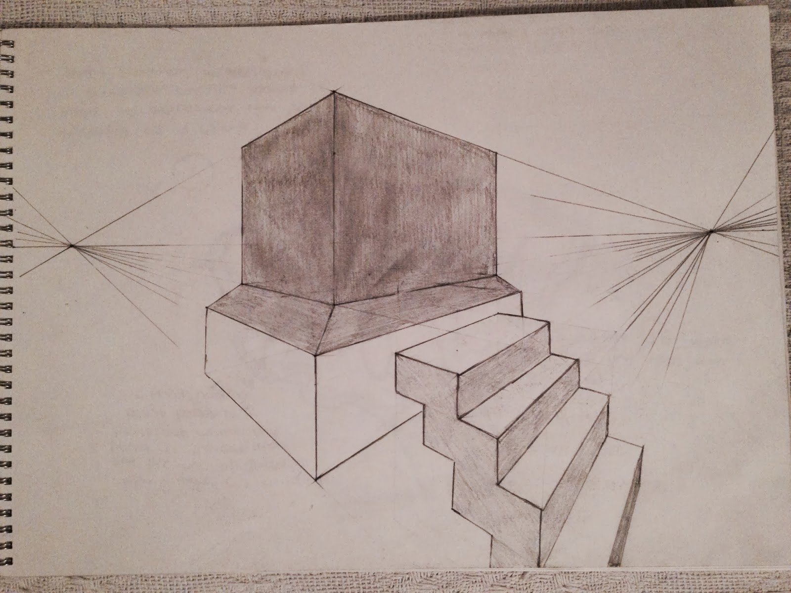
Following on from the 'Architectural designing' post here is one of my pieces of work which I think uses the same principals, the vanishing point must have been used to draw the straight lines and to calculate the scale and therefore produce the correct form and perspective!


Behance link

I am very excited! I have just recently created a Behance account so now you can also find some of my work on there, be sure to check it out, here is the link - https://www.behance.net/FelgueirasDesigns Please & thank you!

Friday, 24 January 2014

Architectural design


Take a look at this incredible art work by a genius named Rafael Araujo. You'd think that there would be some form of computer based editing involved right?.. wrong. 


- In the midst of our daily binge of emailing, Tweeting, Facebooking, app downloading and photoshopping it’s almost hard to imagine how anything was done without the help of a computer. For Venezuelan artist 'Rafael Araujo', it’s a time he relishes. At a technology-free drafting table he deftly renders the motion and subtle mathematical brilliance of nature with a pencil, ruler and protractor. Araujo creates complex fields of three dimensional space where butterflies take flight and the logarithmic spirals of shells swirl into existence. He calls the series of work Calculation, and many of his drawings seem to channel the look and feel of illustrations found in Da Vinci’s sketchbooks. In an age when 3D programs can render a digital version of something like this in just minutes, it makes you appreciate Araujo’s remarkable skill. You can see much more here. (viaArchitectureAtlas)


http://www.thisiscolossal.com/2014/01/architectural-renderings-of-life-drawn-with-pencil-and-pen-by-rafael-araujo/ 


Friday, 17 January 2014

Business Card Designs


Business cards are vital when it comes to getting yourself or your company/ brand known and can be considered one of the most important marketing tools that he has. With it, you are giving your contact information to potential clients or existing customers to make more familiar with your name and at close reach. In order for the business card to do its job well, it must be professional, attractive and most importantly, memorable.

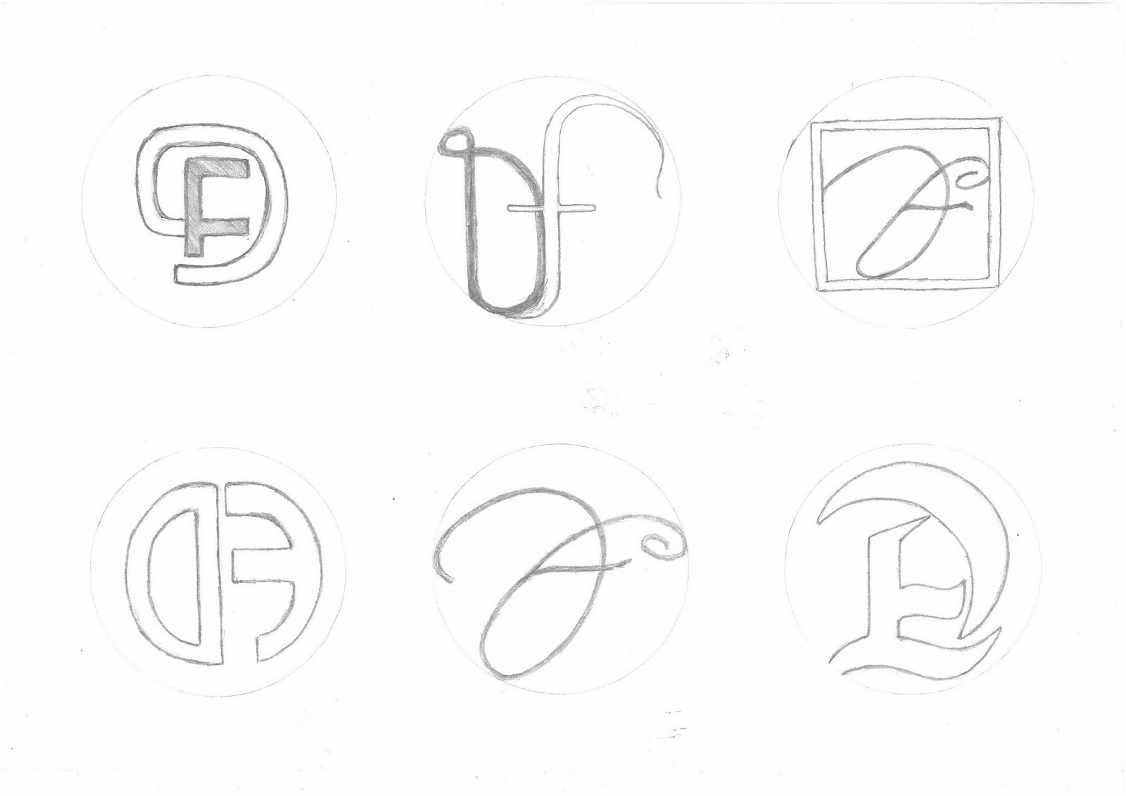
- Here are some of my design drawings and ideas for the creation of my own business card by using my initials as my ideas. I got inspiration for my designs from simply looking at different and creative styles of typography, and of course adding my own unique originality to them.


 This is one of two ideas that I was to choose as my final design that I chose to take further by editing them on (Photoshop), I chose this design because of the style of the typography also an effect was added to change the texture. I think that it is more visually stimulating than most of the other designs. 


I explored adding bright colour to the design, this was because the dark colour of the typography blended with the backgrounds that I was exploring with, so in that aspect I think that this design idea was not the best option, although the white background worked really well because of the contrast.


Here is my second final idea, and the one that I chose as my (FINAL). I like this design because of the simple approach that I took, I also like the gradient effects that I added to my initials (using the line fill option). I chose to use the colour black  because I thought a attractive design would also need an attractive yet simple background. Overall I think that It is an attractive design with a plain background in my opinion it it a good thing because it invites you to look at the design more.   


Here is a view of the the back of the business card, I made it look simple but at the same time it should have a classy touch to it. I added a black version as well  as a white to show variety.   


Here is a view of my main business card design and another design that I otherwise would not be using, while designing I made it so that these designs can interact, you can see this by the way the black from the middle spreads to the other designs.


Obviously these designs can't fit on one small business card but that doesn't mean that they cant be added to posters, leaflets and more  


Sunday, 12 January 2014

Montigu Logo Re-designing


Here is my logo redesigning process, I started by keeping the same foundations of the original logo, then breaking down the different aspect that make up the logo on a whole, in this case I started with the typography and switching between different styles of fonts. By having many choices I am able to try different combinations and then chose the best outcome when piecing everything together.


This is the second part of the design process, here we have illustrative drawings that will accompany the typography in the logo, I chose to explored different drawings of vegetables as the original 'Montagu' brand is for a restaurant and mostly do with food, also for me, having vegetables for me it will add a sense of freshness to the logo.


Finally I refined my illustrations, merged them with the typography and then added the appropriate  colour to to match the vegetable illustrations, with the colours I used the photoshop software to add the air brush painting effect.  Before choosing these designs as my potential final ideas I played around with the order of the designs and eventually came to these conclusions.


This is my final outcome for redesigning of the 'Montagu' logo, I chose this design because of it's  simplicity, I like the way the typo sits on top of the illustration and how well they work together. I also like the way the contrast between the light and the dark work together and do not clash with one another.